如图所示,我又换博客了
这次依然用 Astro Paper 做底子,不同于 v5 版本,Astro Paper v6 是为了迎合 Astro 6 新特性而做的重构,这也是我无法继续打磨老博客的原因之一,没办法,v6太香辣!经过我这段时间的调教,终于有了现在的Astro Lite 6,现整理文档,放心食用
主要技术栈如下:
- Astro v6
- Tailwind CSS v4
- TypeScript v6
- 博客核心内容加载器升级为全新的 Content Layer API
全新的统一配置
在旧版本中,配置项散落在 src/config.ts 和 src/constants.ts 等多个文件里
现在统一到 defineAstroPaperConfig():
import { defineAstroPaperConfig } from "./src/types/config";

export default defineAstroPaperConfig({
  site: {
    url: "https://blog.lhasa.icu/",        // 必填,站点地址
    title: "Astro Lite",                   // 必填,站点标题
    description: "独立之精神,自由之思想",     // 必填,站点描述,用于 SEO
    author: "游钓四方",                     // 必填,默认作者名
    profile: "https://lhasa.icu/",         // 可选,作者主页链接
    ogImage: "default-og.jpg",             // 可选,默认 OG 社交分享图
    lang: "zh",                            // 可选,站点语言,默认 "en"
    timezone: "Asia/Shanghai",             // 可选,站点时区,默认 "UTC"
    dir: "ltr",                            // 可选,文字方向,"ltr" 或 "rtl"
    googleVerification: "Google 验证码",    // 可选,Google Search Console 验证码
  },
  posts: {
    perPage: 15,                           // 可选,每页文章数
    perIndex: 10,                          // 可选,首页文章数
    scheduledPostMargin: 15 * 60 * 1000,   // 可选,定时发布容差(毫秒)
  },
  features: {
    lightAndDarkMode: true,                // 可选,是否启用亮暗主题切换
    dynamicOgImage: false,                 // 可选,是否动态生成 OG 图
    showArchives: false,                   // 可选,是否显示归档页
    showTags: true,                        // 可选,是否显示标签页
    showBackButton: false,                 // 可选,是否显示返回按钮
    editPost: {
      enabled: false,                      // 可选,是否启用「编辑此页」
    },
    search: false,                         // 可选,是否启用搜索功能
    coverUrl: "https://cos.lhasa.icu/dist/images", // 可选,封面图 CDN 前缀
  },
  // https://github.com/achuanya/miniflux-lite
  friends: {
    dataUrl: "/feed.json",                // 必填,友链数据 JSON 地址
  },
  // https://github.com/achuanya/artalk-lite
  comments: {
    server: "https://artalk.lhasa.icu",    // 必填,评论服务端地址
    site: "游钓四方的博客",                  // 必填,评论站点名称
  },
  timeBasedTheme: {
    enabled: true,                        // 可选,是否启用定时主题切换
    lightStart: "08:00",                  // 可选,亮色开始时间
    darkStart: "18:00",                   // 可选,暗色开始时间
  },
  socials: [                              // 可选,社交链接列表
    { name: "github",   url: "https://github.com/achuanya/astro-lhasa" },
    { name: "x",        url: "https://x.com/haibao1027" },
    { name: "mail",     url: "mailto:haibao1027@gmail.com" },
  ],
  shareLinks: [],                         // 可选,分享链接列表
});astro-paper.config.ts
站点元数据、文章分页,评论系统等功能开关都集中在这一个文件
布局
页面外层容器宽度为 768px,由 src/styles/global.css 中的 max-w-app 工具类约束:
@utility max-w-app {
  @apply max-w-3xl;
}
而正文区域则使用较窄的黄金阅读尺寸 720px ,该值定义在 src/styles/typography.css 的 --prose-max-width 中
字体配置
Astro Paper 原生字体配置我砍掉了,虚无缥缈的,感觉不是很受用
现采用衬线体,思源宋体,非常适合阅读,代码块则指定为经典等宽编程字体 Fira Code
@theme inline {
  --font-app: "Source Han Serif SC", serif;
  --font-heading: "Source Han Serif SC", serif;
  --font-heading-sub: "Source Han Serif SC", serif;
  --font-ui: "Source Han Serif SC", serif;
  --font-bold: "Source Han Serif SC", serif;
  --font-code: "FiraCode", "Source Han Serif SC", monospace;

  --font-sans: var(--font-app);
  --font-serif: var(--font-app);
  --font-mono: var(--font-code);
}theme-inline.css
博客文章格式
文章统一存放在 src/content/posts/ 中,由 Content Layer API 的 glob 加载器扫描,匹配规则为 **/[^_]*.{md,mdx}
支持任意层级的子目录,同时忽略以下划线 _ 开头的文件
URL 由「目录结构 + 文件名」共同决定,目录名与文件名都会经过 slugify 处理(转小写、空格/下划线转连字符):
# 示例:文章文件路径及其对应的 URL
src/content/posts/demo.md
  -> /posts/demo

src/content/posts/life/2024-01-22-The_song_begins.md
  -> /posts/life/2026-05-28-zhuanzhu/

src/content/posts/technology/2026-06-11-astro-lite-v6.md
  -> /posts/technology/2026-06-11-astro-lite-v6
也就是说,你只需要把文章丢进对应的分类目录,URL 便会自动按目录层级生成,无需手动配置路由
示例 Frontmatter
每篇文章顶部都是一段 YAML Frontmatter,由 src/content.config.ts 中的 Zod Schema 校验:
---
author: 游钓四方                              # 可选,不填则采用站点 author
pubDatetime: 2026-06-10T18:39:00+08:00       # 必填,ISO 8601 带时区
modDatetime: 2026-06-11T09:00:00+08:00       # 可选,最后修改时间,可为 null
title: Astro Lite 6                          # 必填,文章标题
featured: false                              # 可选,置顶文章
draft: false                                 # 可选,草稿
tags:                                        # 可选,不填则采用 ["others"]
  - 杂谈
  - 前端
description: 一句话摘要,用于列表与 SEO          # 必填
cover: cover.svg                             # 必填,文章列表封面图
ogImage: default-og.jpg                      # 可选,OG 社交分享图(编辑已禁用)
canonicalURL: https://example.com/original   # 可选,规范链接,避免重复内容
timezone: Asia/Shanghai                      # 可选,单篇时区,不填则采用站点 timezone
hideEditPost: false                          # 可选,单独隐藏「编辑」入口(编辑已禁用)
---
原生 MDX 支持
通过 @astrojs/mdx 集成,文件除了完整的 Markdown 语法外,还能直接导入并使用组件、写 JSX 表达式:
---
title: 在 MDX 中使用组件
description: 演示 MDX 能力
pubDatetime: 2026-06-11T12:00:00+08:00
---

import Chart from "@/components/Chart.astro";

# 普通标题

正文里可以直接插入组件:

<Chart data={[1, 2, 3]} />

也支持 JS 表达式,例如 { 1 + 1 } 会渲染为 2
需要交互式图表、可视化或自定义排版时用 .mdx;纯文字博客用 .md 即可,二者 URL 规则一致
提示框
由 rehype-callouts 提供,采用 Obsidian 主题,语法与 GitHub 一致
> [!NOTE]
> 一般性提示信息,

> [!TIP]
> 小技巧、最佳实践,

> [!IMPORTANT]
> 关键信息,务必阅读,

> [!WARNING]
> 警告,需要谨慎操作,

> [!CAUTION]
> 高风险操作,可能造成不可逆后果,一般性提示信息,
小技巧、最佳实践,
警告,需要谨慎操作,
除上述常用类型外,还支持 info、abstract、success、question、failure、danger、bug、example、quote 等多种类型,每种类型都有其专属的图标和颜色
完整的参考请查看 rehype-callouts 文档
可折叠提示框
在类型后追加 -(默认折叠)或 +(默认展开),即可得到可折叠提示框,标题后可附自定义标题文字:
> [!EXAMPLE]- 点击展开查看示例
>
> 这里是被折叠的详细内容,适合放冗长的代码或补充说明

> [!TIP]+ 默认展开但可手动收起
>
> 适合放重要但篇幅较长的提示
点击展开查看示例
这里是被折叠的详细内容,适合放冗长的代码或补充说明
语法高亮
代码高亮基于 Shiki,亮色主题为 min-light,暗色主题为 night-owl,随全站主题自动切换
文件名标签:在代码围栏的 info string 中加上 file="文件名",即可在代码块顶部渲染带绿点的文件名徽标(由自定义的 transformerFileName 实现,样式为 v2):
```typescript file="astro-paper.config.ts"
export default defineAstroPaperConfig({ /* ... */ });
```行高亮、增删标记、词高亮:借助 @shikijs/transformers,用注释即可标注:
// [!code highlight]:高亮整行
// [!code ++]:绿色
// [!code —]:红色
// [!code word:xxx]:diff
const keep = 1;
const focus = 2;
const added = 3;
const removed = 4;
function run(target) {
  return target;
}demo.js
图片
- 存放在
src/assets/目录中
你可以将图像存储在 src/assets/ 目录内, 这些图像会通过 Image Service API 自动获得 Astro 的内置优化,随后使用相对路径(@/assets/)来引用这些图像
示例:假设您想要显示位于 src/assets/images/example.jpg 的图片:


<img src="@/assets/images/example.jpg" alt="example">从技术上讲,你可以将图片放在 src 下的任何目录中, src/assets 仅仅是一个规范
- 自托管使用内置的 Photosuite
更推荐的方式是把图片托管到云存储,再交给 Photosuite 统一接管
它在 astro.config.ts 中以集成方式启用:
import photosuite from "photosuite";

export default defineConfig({
  integrations: [
    photosuite({
      scope: "#article",                               // 仅处理文章正文内的图片
      imageBase: "https://cos.lhasa.icu/dist/images/", // 图片 CDN 前缀
      fileDir: true,                                   // 按文章路径归类图片目录
    }),
  ],
});astro.config.ts
接入后,文章里只需写相对的图片名,Photosuite 会自动补全 URL
评论系统
评论则使用我二次开发的 Artalk,全新的 UI 设计,还新增了一些实用功能,更贴合本博客的极简调性:
comments: {
  server: "https://artalk.lhasa.icu",
  site: "游钓四方的博客",
},astro-paper.config.ts
src/components/Artalk.astro 会读取这份配置,在客户端异步加载 Artalk.css 与 Artalk.js,再以当前页面 pathname 作为 pageKey 初始化评论实例
主题样式配置
全站支持亮 / 暗双主题(features.lightAndDarkMode),并且会按设定时间自动切换:
timeBasedTheme: {
  enabled: true,
  lightStart: "08:00",  // 08:00 起进入亮色
  darkStart: "18:00",   // 18:00 起进入暗色
},astro-paper.config.ts
主题逻辑位于 src/scripts/theme.ts,优先级如下:
- 用户手动选择,最高优先级,一旦手动切换就不再被自动主题覆盖
- 时间区间,按
lightStart/darkStart判断当前应为亮或暗) - 系统偏好(
prefers-color-scheme) - 默认为
light
切换时若浏览器支持 document.startViewTransition(),会以 clip-path 揭示动画平滑过渡,并同步更新 <html> 的 data-theme、dark 类以及 meta[theme-color]
颜色全部为 CSS 变量,分别定义在 theme-light.css / theme-dark.css,再由 theme-inline.css 桥接到 Tailwind v4 的 @theme:
:root, [data-theme="light"] {
  --background: #ffffff;
  --foreground: #0d141e;
  --accent: #212832;
  --border: #1f1e1d;
  --nav-link: #2ea9df;
  --blockquote-border: #2ea9df;
  --code-block-bg: #fafafb;
  --skeleton-base: #e9e9ec;
  --skeleton-highlight: rgba(255, 255, 255, 0.6);
}theme-light.css
文章排版配置
正文排版在 src/styles/typography.css 的 .app-prose 类中,基于 @tailwindcss/typography,并用一组设计 token 统一:
:root {
  --text-h1: 1.375rem;     /* 标题字号 */
  --text-h2: 1.125rem;
  --text-h3: 1rem;
  --leading-body: 1.65;    /* 正文行高 */
  --leading-heading: 1.35; /* 标题行高 */
  --block-gap: 0.75rem;    /* 块间距 */
  --prose-max-width: 720px;/* 约 45 字符的最佳阅读行宽 */
}typography.css
关于排版的设计,我参考了 Typora 主题 Typora Claude,编辑器与博客渲染几乎无差异,所见即所得
无限滚动
全站列表采用无限滚动,实现见 src/scripts/infiniteScroll.ts:
<!-- 列表末尾放一个哨兵,data-next-page 指向下一页 -->
<div id="infinite-scroll-sentinel" data-next-page="/posts/2/" />index.astro
const observer = new IntersectionObserver(handle, { rootMargin: "300px" });infiniteScroll.ts当哨兵进入视口前 300px,脚本就 fetch 下一页 HTML,用 DOMParser 解析后把 #post-list > li 拼接到当前列表,并更新哨兵的 data-next-page
由于 Astro 的 View Transitions 会在每页重置 scope 计数,脚本还会重写 data-astro-transition-scope 与对应 <style>,避免拼接后出现 view-transition-name 冲突,各页面只需在 astro:page-load 时调用 initInfiniteScroll() 即可
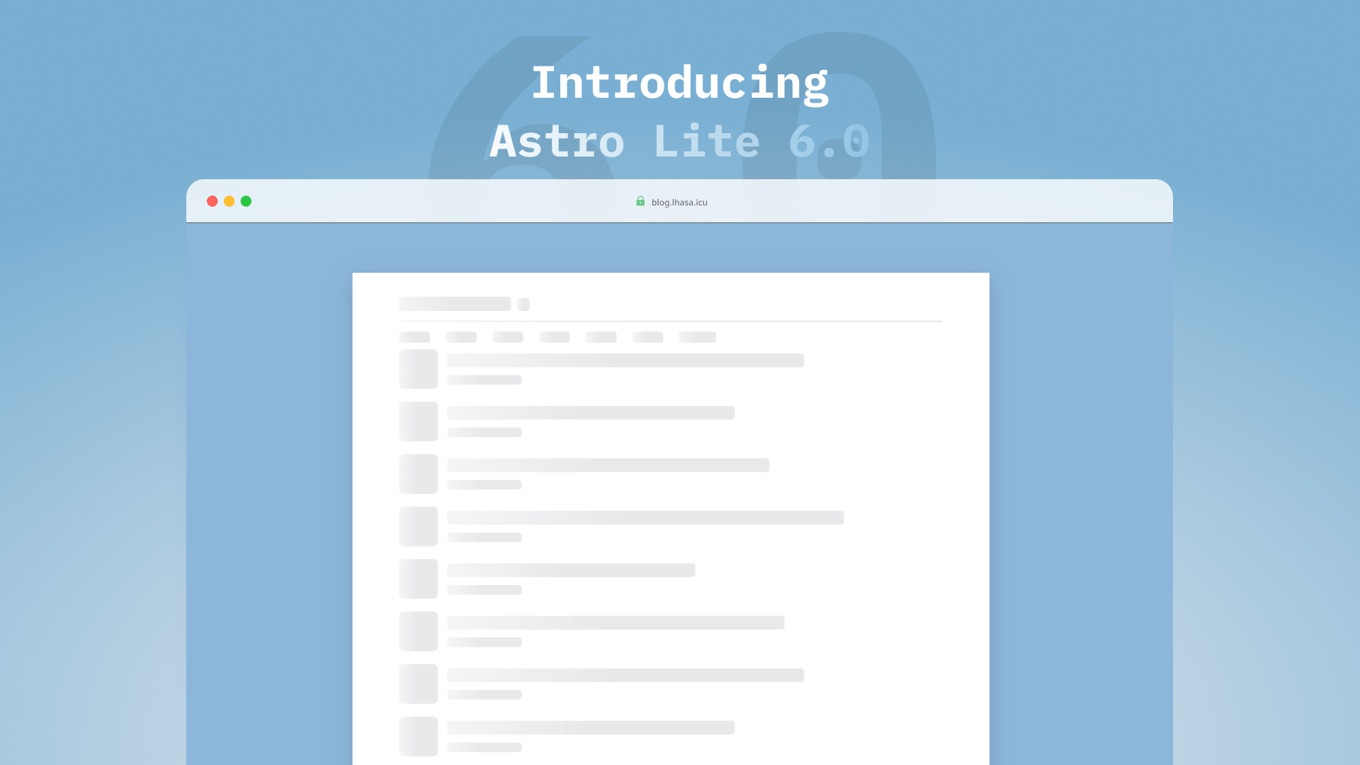
骨架屏
配合无限滚动交互,网页在数据与资源加载前会默认展示骨架屏占位:
<div class:list={[
  "skeleton",
  circle ? "rounded-full" : rounded,
  { "skeleton-shimmer": animation === "shimmer", "animate-pulse": animation === "pulse" },
]} style={style} />src/components/skeleton/Skeleton.astro
微光(shimmer)动画采用 1.6 秒循环的横向高光扫过设计,并原生适配 prefers-reduced-motion无障碍规范:
.skeleton-shimmer::after {
  background-image: linear-gradient(90deg,
    transparent 0%, var(--color-skeleton-highlight) 50%, transparent 100%);
  animation: skeleton-shimmer 1.6s ease-in-out infinite;
}
@keyframes skeleton-shimmer {
  100% { transform: translateX(100%); }
}skeleton.css
在此基础上,还封装了 PostCardSkeleton、PostListSkeleton 与 CategoryGridSkeleton 等组件。其中 PostListSkeleton 默认按 posts.perPage(15条)渲染,此外,所有骨架屏均标记 aria-hidden="true",对屏幕阅读器完全透明
至此,Astro Lite v6 的大概能力就介绍完了
源码已开源在 achuanya/astro-lhasa,欢迎 Fork 食用